DWP Accessibility Manual
Overview
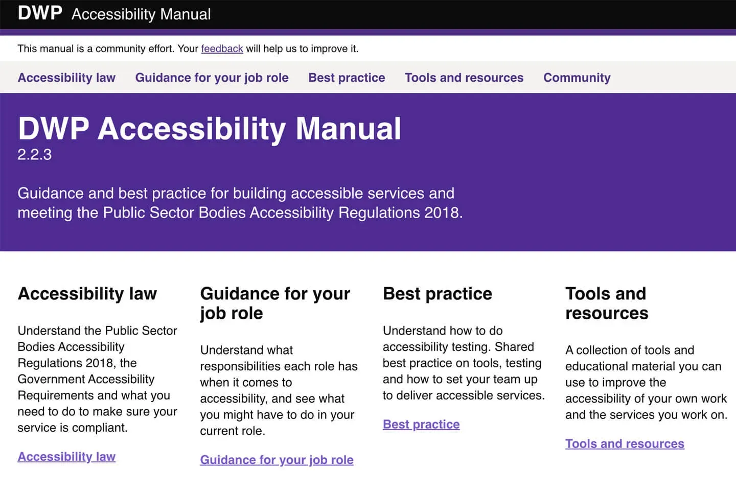
The DWP Accessibility Manual is one of the projects I'm most proud of. It is a collection of accessibility guidance and best practice all in one place.
I've contributed countless hours, pushed over 60,000 lines of code, written pages and pages of guidance, but I want it to be owned by the community. So, it's completely open source. View the DWP Accessibility Manual on GitHub, contribute to it, and feel free to reuse any of the codebase for your own projects.
The project is based heavily on the GOV.UK Design System, only it is using a different configuration behind the scenes to make it feel more like the GOV.UK Prototype Kit. It uses Nunjucks and Markdown, so pages and guidance are easy to update and contribute to.
Situation
People were confused by the accessibility regulations and how they applied specifically to their job role. There was a general misconception that accessibility was 'just the developers job'.
The guidance that existed was either overly complicated or overly simplified, and there was no single place to learn about accessibility.
There's a lot of guidance on GOV.UK but it is fragmented and you have to do a lot of work to figure out what you need to do for your job role in particular.
For example
- Accessibility Requirements for Public Sector websites and apps
- Service Manual: Making your service accessible
- Guidance and tools for digital accessibility
Task
Write documentation and guidance which makes it clear what people need to do to build accessible services, and to pull together what other documentation was out there into one place.
Action
User Research
I collaborated with a Senior User Researcher to conduct some research with all the different professions across Digital. We gathered insights from Interaction Designers, Content Designers, User Researchers, Business Analysts, Product Managers, Developers etc.
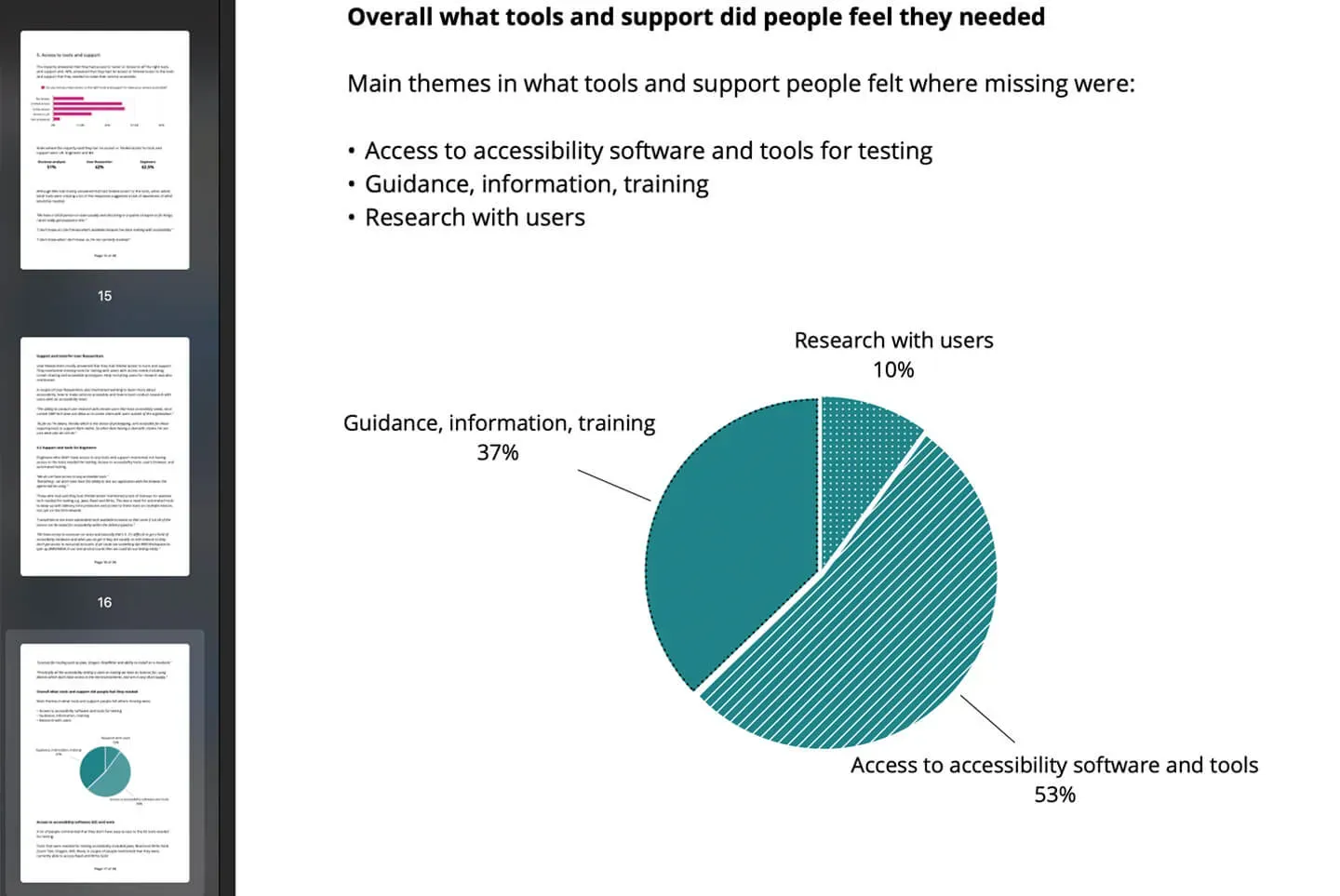
We ended up with a 26 page report which clearly showed that very few roles knew exactly what they were supposed to be doing for accessibility.
It showed that:
- 37% of people lacked guidance, information and training
- 53% of people lacked access to software and tools
- 10% of people struggled to recruit users
Building an application
I initially started building an application using the GOV.UK Prototype Kit. But it quickly became bloated and unwieldy.
Because the Prototype Kit uses vanilla HTML and Nunjucks, it is also more difficult for people to contribute to.
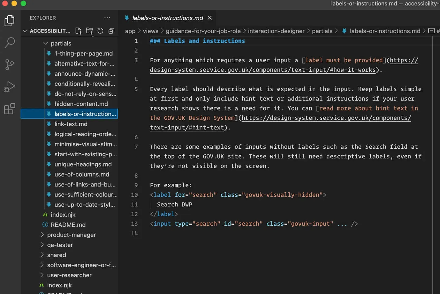
So, I started again with a fork of the GOV.UK Design System. I was able to utilise all the hard work already done across Government and quickly start to build out an app structured for documentation using Markdown as the primary format.
Guidance for your job role
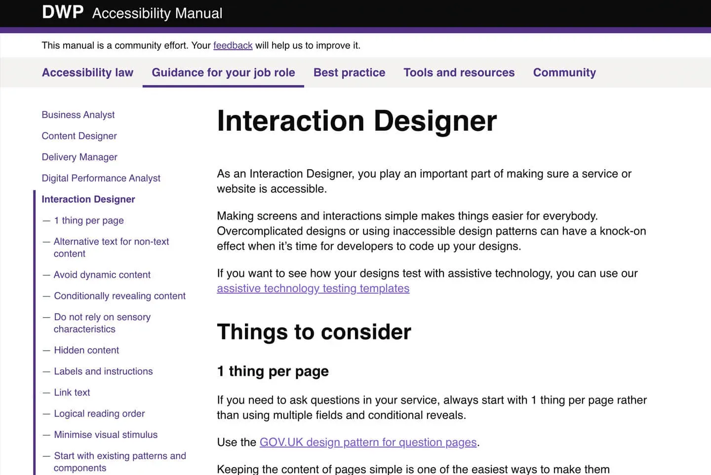
The most important part was to make sure I wrote very specific examples for each job role, covering all of the common mistakes we often see.
For example, in the guidance for an Interaction Designer it covers some of the accessibility pitfalls with things like:
- Dynamic content
- Conditional reveals
- Sensory characteristics
- Hidden content
- Link and buttons
- Use of columns
- Colour contrast
Best practice
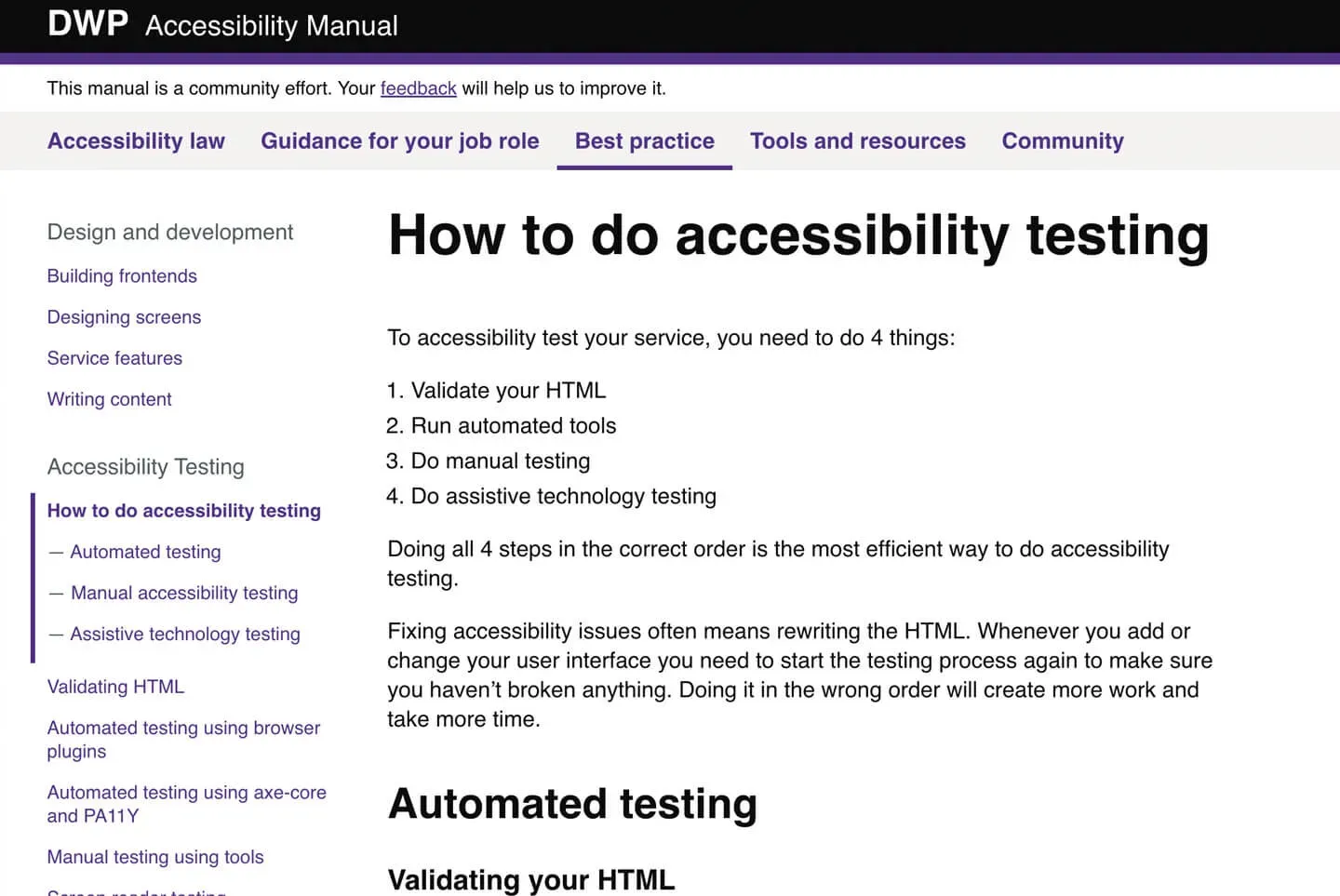
Another core element of the Accessibility Manual is to teach people the most efficient way to build accessibility into their product life cycle.
I wrote guidance on:
- an overview on how to do accessibility testing
- validating your HTML
- accessibility testing with browser plugins
- automated testing using axe-core and PA11Y.
- screen reader testing
- voice controller testing
- screen magnifier testing
Humanising accessibility
A lot of the problems with the culture around accessibility is that people see it as a technical problem rather than a user-centred one.
To combat this, we pulled together the most common issues we find when testing services and cross referenced this with the figures released by the Central Digital and Data Office (CDDO).
We wrote checks for each of the most common issues and grouped them into a list of 10 basic accessibility checks you need to do. We then wrote personas to humanise why these accessibility problems cause issues for people. The personas are anonymous, but they're based on real observations from user research sessions. For example, Charlie has Retinitis Pigmentosa and struggles when he cannot use a website in a portrait view. You can read Charlies accessibility persona in the DWP Accessibility Manual.
Result
The DWP Accessibility Manual has been a huge success. It is used regular by designers all over Government and in the Private Sector.
I've since collaborated with GDS to make sure all the guidance is aligned, and they now feature it in: