Design Patterns at DWP Digital
Overview
This work on Design Patterns at the Department for Work and Pensions predates the DWP Design System and GOV.UK Design System.
The work was done in the open, in collaboration with a lot of the awesome people working on those systems.
Situation
Across DWP Digital, a lot of people were designing similar solutions to solve identical issues. We were starting to re-design internal systems and there were no proven design patterns or re-usable components.
For example. We had a simple user story such as:
As a member of staff who processes benefits,
I want to be confident I'm looking at the right claim,
So that my advice is accurate and any amendments I make are correct.
Designers would go through the process, and inevitably design a solution which worked. But, like the Tenrec of Madagascar, the evolution of the design was done in isolation and just happened to be very similar to other designs which worked.
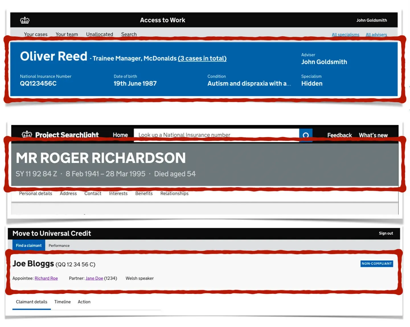
Design maturity was a problem
There was no DWP Design System or GOV.UK Design System at the time. The terminology was not as widespread as it is now, so designers often struggled to understand the difference between a pattern and a component.
GOV.UK Elements did exist. But it was just a collection of HTML Elements, not consumable components or patterns. There were no patterns listed anywhere at the time for internal systems.
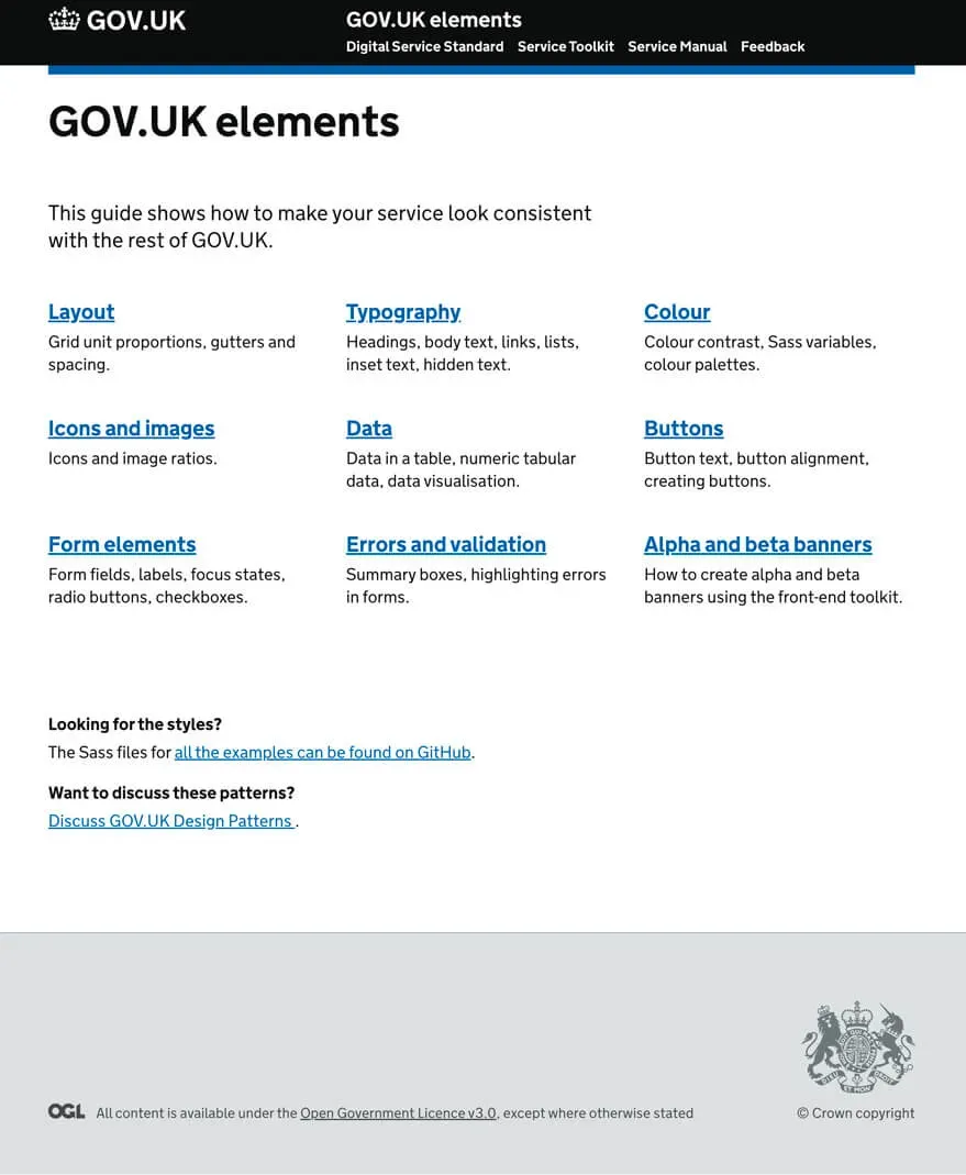
Task
Consolidate existing designs and prevent design silos forming again in future.
Build a library of re-usable design elements that help designers working on internal systems in DWP.
Build a strong community where designers are open to showing their work regularly and collaborating with others.
Action
It started by getting willing people together and having discussions.
We needed designers to work together in a unified way, but we quickly realised the language around patterns and components was confusing, which is why many designers were reluctant to get involved.
We changed the language (temporarily) around patterns and components, and just started calling them 'Design Examples'. It didn't really matter whether it was labelled as a pattern or a component. That was a technical detail for later.
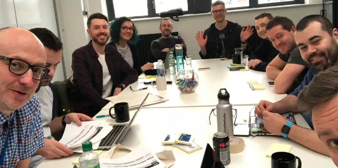
What mattered was that designers understood the design intent and could re-use it easily. When I started calling them 'Design Examples meet-ups' attendance jumped by 340%.
Workshops
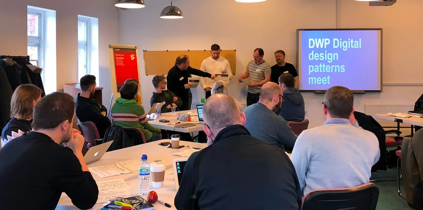
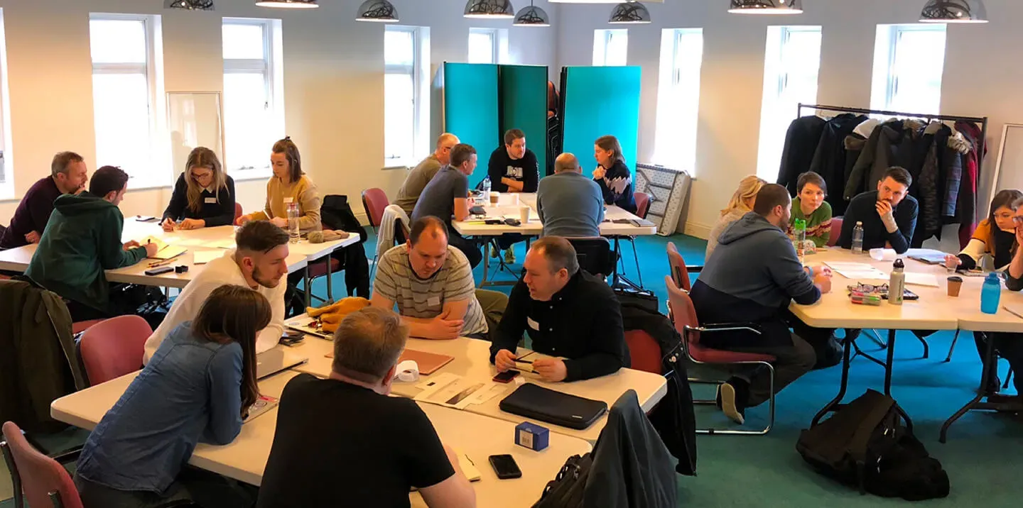
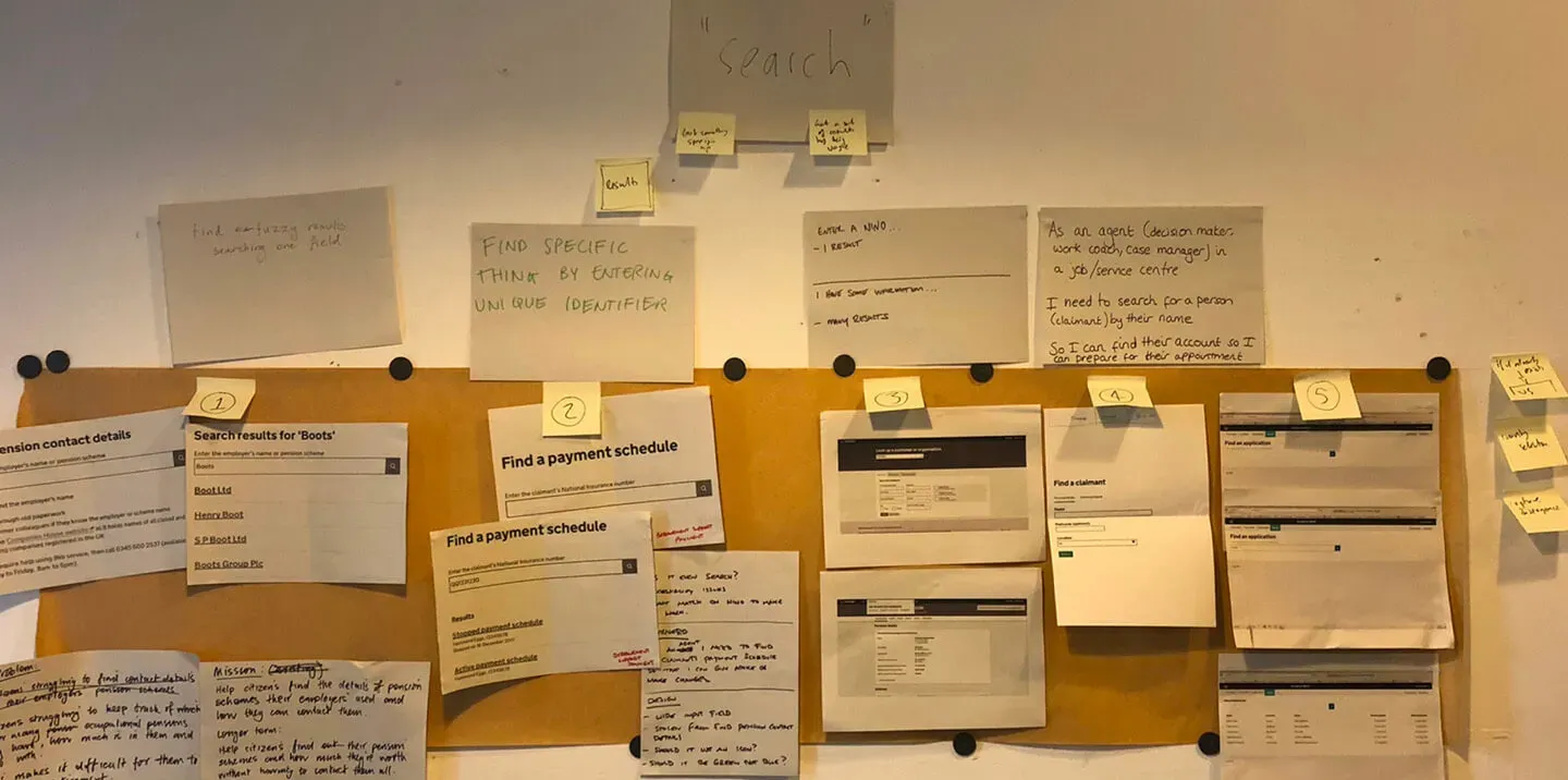
Once we had the numbers, we started to run workshops with up to 50 designers at a time.
We'd consolidate ideas, grouping similar designs to discuss how the research had informed each one.
Tracking progress
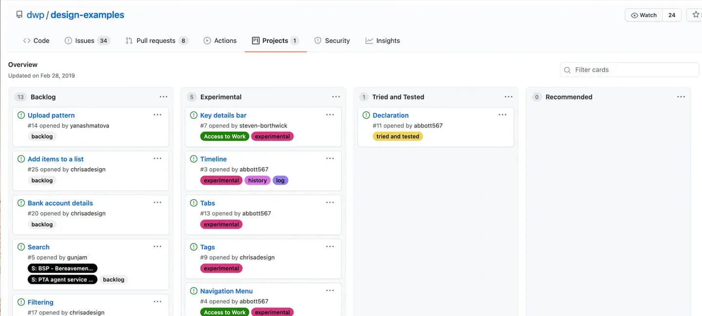
The design examples were tracked and matured in GitHub. The project has unfortunately been archived and is no longer public.
We tracked designs as issues with tags and once they were proven to work in several services, we would progress them in maturity.
The backlog was stuff we knew we needed to look at but hadn't got around to workshopping yet.
Experimental was similar to the Alpha phase. These patterns had been workshopped but they weren't being used enough yet to know if they were working as expected. They were likely to change fairly regularly as we learned how they behaved in practice.
Tried and tested was similar to the Beta phase. These patters were being used in multiple services and working well. We were confident in them, but they still might have had minor changes made to them as we learned more.
Recommended was similar to the Live phase. These patterns had been used in multiple services without issue and had reached a state of maturity where they were very rarely being iterated.
Documentation
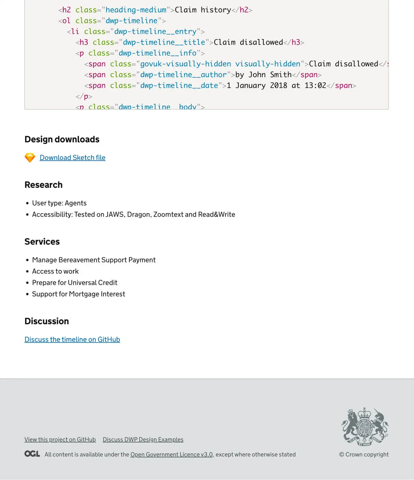
We documented each example with typical content on:
- When to use a design
- When not to use a design
- HTML
- CSS
- SASS
- JavaScript
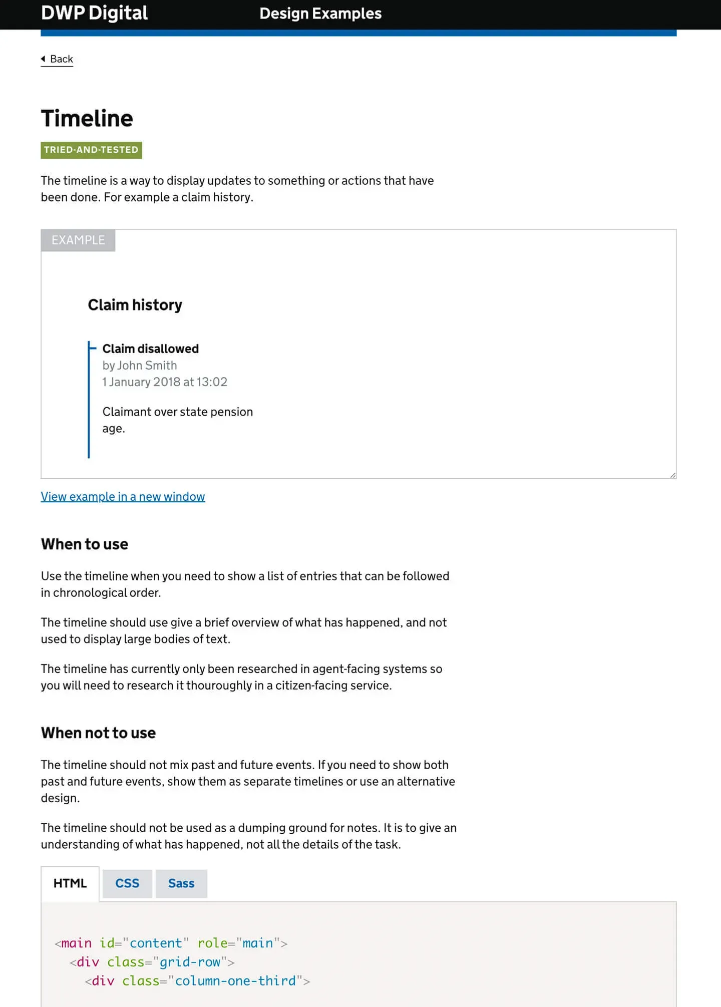
This was 'documentation by designers, for designers'. So, based on user needs, I also included artefacts and additional information such as:
- A Sketch file
- Whether it was citizen or staff facing
- Accessibility testing
- Which services it was being used in
- Links to the discussions informing the design
Result
Services automatically felt familiar and intuitive.
Users were confident they knew how a design worked, even on a new service, because they had seen the design before.
Contributing to the wider community
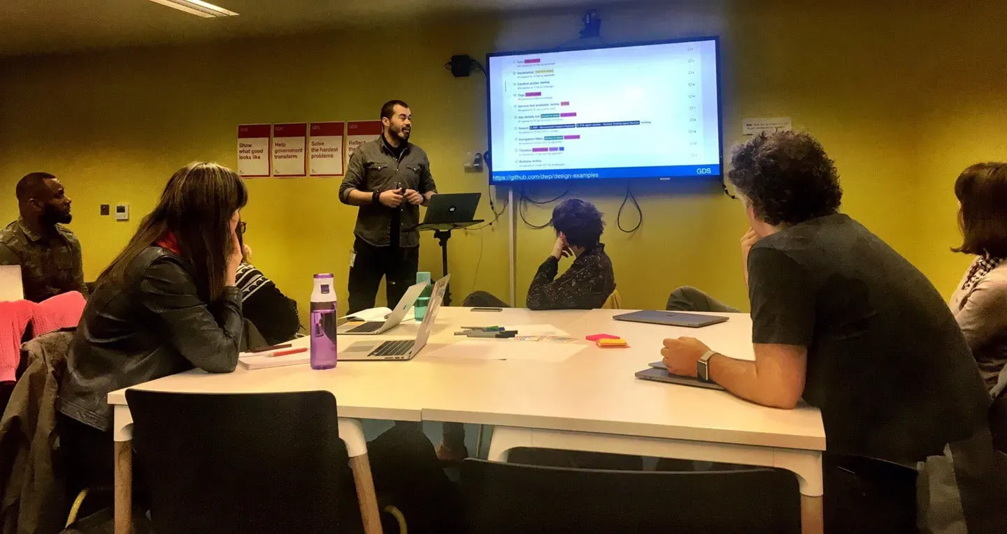
I'd regularly feed back our work at the X-Gov Design Meet-ups and to GDS.
A lot of what we did helped to inform some of the early work in the GOV.UK Design System.
Aligning with the rest of Gov
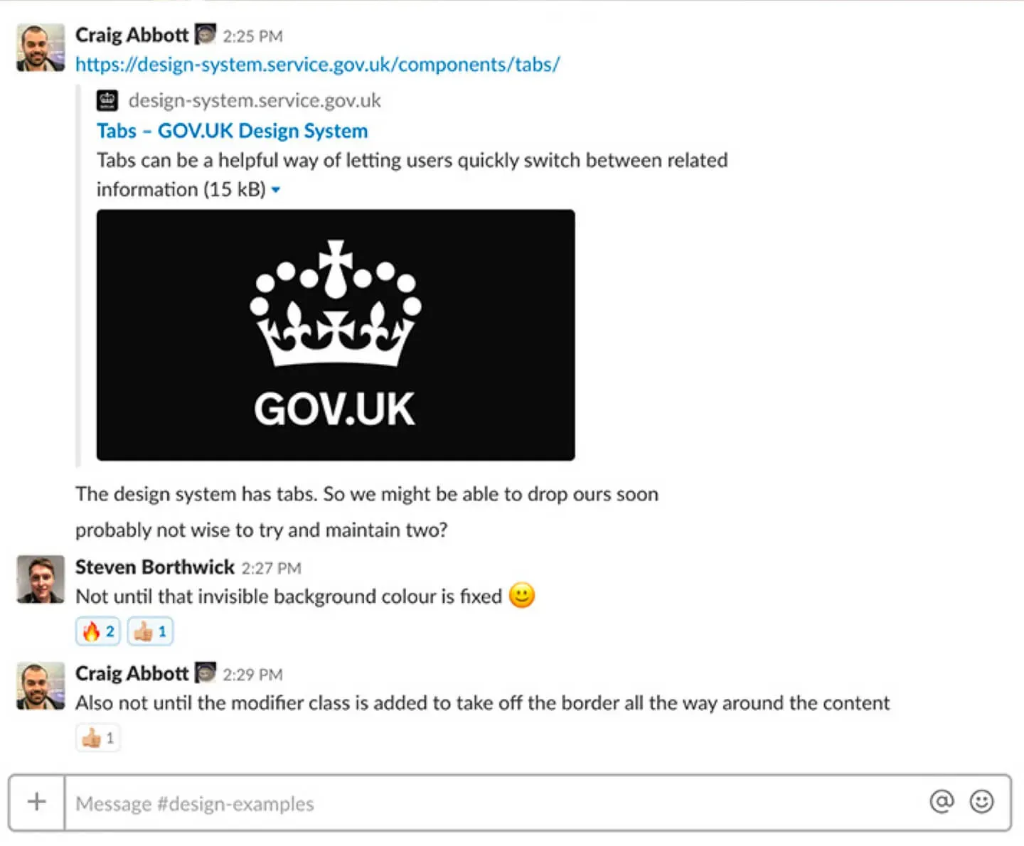
When GDS published similar components we'd review ours to see if they could be retired.
DWP Design System
The Design Examples work proved we needed a Design System of our own. DWP now has a dedicated team. But a lot of what we did has been consumed by both the DWP Design System and the GOV.UK Design System.