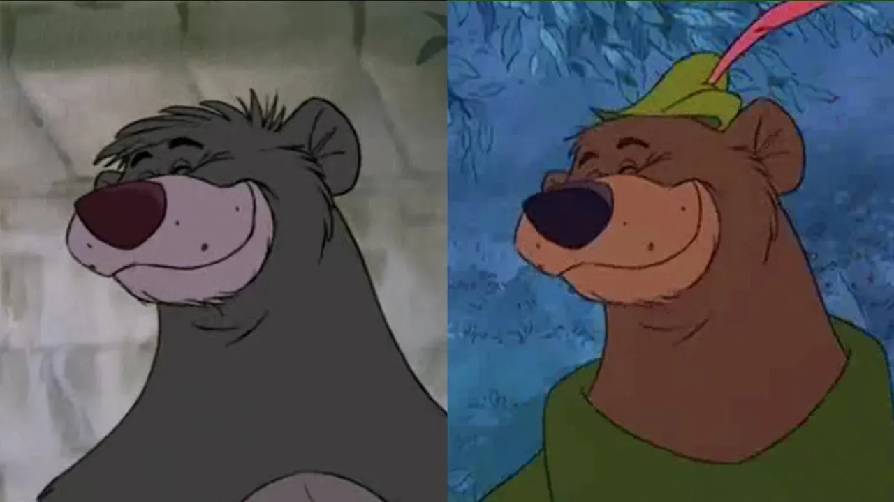
What can Baloo teach us about design?
It seems everybody is talking about design systems at the moment. And with good reason.
I mean, if you can meet the same user need with the same design more than once, it saves time and energy, right?
A defined pattern or component should have gone through plenty of research. So, it's also reassuring to know the design is likely to work with little effort.
I first started noticing reusable components on the web around 2011. Twitter's Bootstrap had a list of them: jumbotrons, alerts and button-groups to name a few.
These component are chunks of CSS, HTML and sometimes JavaScript, that go hand-in-hand, and as long as you had Bootstrap installed, it just worked.
Re-usable design is not a new concept
The idea of design-reuse has been around for many years.
Walt Disney reused many scenes. They also reused entire characters. Cartoon creators called this re-animation. It's the process of tracing over existing frames to save time and money.
You may not have noticed before, but Disney's Baloo and Little John are almost identical. They were even voiced by the same person, Phil Harris.

When I've pointed this out, some people say they feel cheated. There's an impact on the nostalgic childhood memories of our most beloved characters. But, like identical twins, Baloo and Little John have their own loveable personalities. They may look and move the same, but they're very unique in their characters.
Without this re-use it would be impossible for Disney to churn out as many classic cartoons as they did, and this would arguably have made my childhood way worse!
Re-usable design in digital services
If you put one bear in the jungle and the other in Sherwood Forest, the fact they look alike becomes irrelevant.
What Disney figured out, is that people fall in love with their movies because of the story. It's not just the character design. It's their personality. The script they deliver. The way they interact with their world and the other characters in it.
Context is everything!
We design services, and every service is different. But, the interactions are often the same.
When we start on a new service, we shouldn't have to waste time wondering about button colour. By reusing existing components we can spend all our time looking at the real problems. This is better for us as designers, but most importantly, it's better for the people that have to use the service.
Reanimating a bear gave Disney more time to focus on the stuff that's important. And we should too. This is exactly why design systems are a good idea!
Post details
- Published:
- Read time:
- 2 minutes