Making microservices accessible
Overview
I've written this post to be comprehensive, which unfortunately makes it a bit longer than usual.
If you don't want to read the whole thing, you can use the following links to find the parts you want to read:
What is a microservice?
The term 'microservice' is becoming more and more popular when you look across the Digital landscape of a lot of big organisations.
In short, a microservice is just a small part of the user journey which focuses on one specific task. They're not end-to-end, they just do one thing and then they hand-off. For example, taking a credit card payment.
I recently attended SD in Gov, where again, microservices came up a lot.
I saw a great talk by Fritz Von Runte, which was beautifully illustrated, well presented, and used the analogy of each microservice being a Lego brick.
The idea is that each brick is a little self-contained application, and you can very quickly stick them together to build digital services which should, in theory, just work.
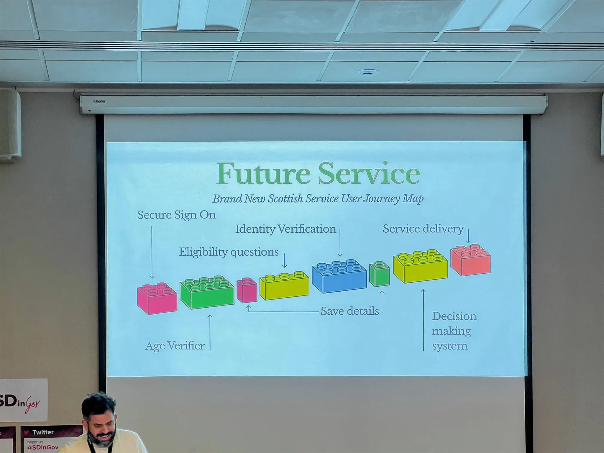
Several Government departments, and several large organisations I've spoken to recently, are all looking at this approach; because, if executed well, it saves time and money, and they create consistency for users.
However, as more and more organisations try to leverage microservices, the pitfalls of accessibility are perhaps not being fully considered.
The crux
The important part, which the entire approach is hinged on, is where you build the user interface.
If you take nothing else away from this post, take away this point.
Where the user interface sits and who owns the codebase is key. If you get it wrong, the entire approach becomes brittle or extremely time consuming to get right.
It becomes a single point of failure, and it will also bring down any service which integrates with it.

To stick with Fritz's analogy, while it's easy to make each Lego brick accessible on its own, people often fail to take a step backwards and look at the accessibility of the end-to-end journey once you stick all the bricks together.
A lot of the Web Content Accessibility Guidelines (WCAG) are about consistency and context, and that cannot be tested in isolation.
You could end up with 3 or 4 fully compliant microservices, but when stuck together they're no longer compliant.
Examples
There are several ways to implement microservices, but the two that seem to be the most popular are the 'redirect approach' and the 'API' (Application Programming Interface).
Let's take a more in-depth look at each one, and some of the things you'll need to consider.
The redirect approach
In this scenario, each microservice is an entirely separate application.
It hosts its own front-end on its own domain, and at various points in the journey, the user is redirected from one application to another, providing them with a supposedly seamless journey.
This is often a short-sighted approach. It's an over-simplification of a complex system, which often leads to it being executed poorly.
It's not to say it will not work, but mistakes are usually made off the back of 3 assumptions.
It's assumed:
- the microservice will always be used in the exact same context
- the redirects will largely go unnoticed
- the user journey is always linear
Let's look at these 3 assumptions and the common mistakes.
Context is everything
The context of every service is different. Not all users are the same, so if your user interface is static, it's going to cause issues.
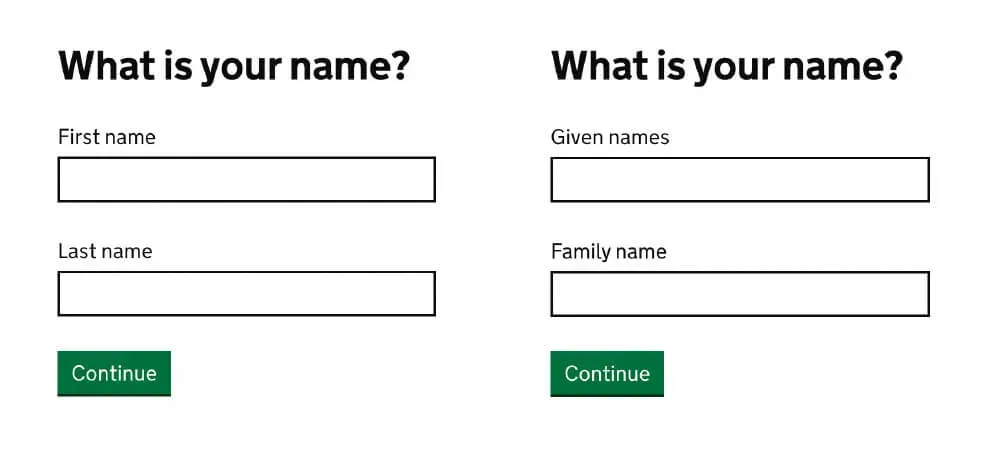
For example, when collecting names, in a service such as Get your State Pension, the majority of users will be from the UK. So, you're going to want to label your input fields 'first name' and 'last name' to fit with UK naming conventions.
But, on a service such as Apply for a National Insurance number, you're going to want to use 'given names'; and 'family names', because it's likely that your users are not from the UK.
This guidance is outlined in the GOV.UK Design Pattern for names.
If you hard-code 'first name' and 'last name' labels into your microservice, it's too brittle. It's not going to cater for other cultures or nationalities where their names don't fit the UK conventions.
Another thing to note, is if the User Researchers and Designers can't influence the user interface, you're effectively shutting down your organisations ability to do User Centred Design.
You'll need to work out how to make the interface configurable, and that means taking on a lot of extra responsibility.
Because you own the user interface, you will probably need to onboard any service which wants to integrate and configure it suit their needs. This is a bottleneck which causes delays and additional work for your team.
Alternatively, you might have to allow services to attach a configuration payload into the headers when it redirects the user, which is clunky and probably has security concerns.
Transparency is good
The majority of the WCAG issues are caused when you try to make the journey seamless. It's deception that causes most of the problems.
When doing a seamless redirect, it's only seamless to sighted users who are perhaps not giving it their full attention.
If the page looks roughly the same, people might not notice the subtle changes. But, to a blind user, if the landmarks, menus and ordering have changed, it's not seamless at all, it's completely different.
In the redirect approach, the microservices are not the same application, they're a bunch of completely separate applications stuck together. So, when you try and dupe the user into believing they are a single application, it causes confusion and can lead to lack of trust in the service as a whole.
If you're up front, and you explain to the user before they're redirected that it's about to happen, quite a few of these issues will go away.
For example:
When you select 'continue' you will be redirected to our Identity Service. Once we've confirmed your details you can continue with your application.
Session management is hard
The biggest challenge you'll probably face with the redirect approach is session management. Handing off sessions and securely maintaining state across multiple applications is no easy task.
A user journey is often perceived to be linear, and in most cases they will be. But, there's a back button in the browser for a reason. People use it, and it needs to work.
Depending on the design, the user might also be able to jump back to certain points of the journey. For example, they may use a 'change' link from the 'check answers pattern' to amend a typo.
The tricky part of the redirect approach is that sessions will need to be maintained and synchronised across all microservices, even when they're not currently active.
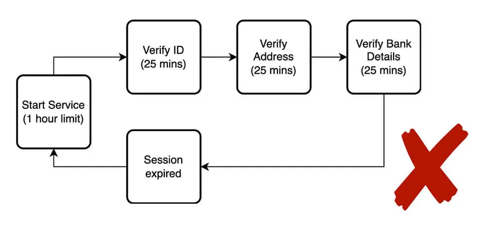
If the session times out on one microservice while the user is currently active on another, during one of the hand-offs it's going to fail.
Assistive technology is great. But for a lot of users, it's substantially slower. You need to take this into account, or it could be impossible for them to complete the service.
WCAG considerations
2.2.1 Timing Adjustable
Most digital services have to consider 2.2.1 Timing Adjustable due to session management. It's standard practice to time the user out after 1 hour of inactivity.
If your session times out in less than 20 hours, to pass this criterion the user will need to be given an opportunity to extend their session. And this must work across the end-to-end service.
If at any point the end-to-end service breaks because the user was redirected to a microservice where the session has been destroyed, and they were not given the opportunity to extend it prior to this happening, it would fail.
2.4.2 Page Titled
To pass 2.4.2 Page Titled, the title needs to describe topic or purpose. It expects that:
'Titles identify the current location without requiring users to read or interpret page content.'
This one can get a bit subjective, so here are some things to consider.
The common title pattern for a GOV.UK service is:H1 - Service name - GOV.UK
A real-world example might be:What is your name? - Apply for Universal Credit - GOV.UK
This provides 3 levels of context for screen reader users. You know what the page relates to, what service you're currently on, and that it's part of GOV.UK.
Now, imagine there's a 'seamless redirect', the title is now:What is your address? - Verify your identity
To a blind user, the entire context of the service is gone. They will likely have questions:
- What has happened?
- Am I still applying for Universal Credit?
- Have I clicked on something by mistake?
- Is it a cyber-attack, and is my personal information safe?
3.2.3 Consistent Navigation
To pass 3.2.3 Consistent Navigation, things like navigation menus, which appear on multiple pages, need to be consistent. This means they need to be in the same place, contain the same wording, and be in the same order each time the user encounters it.
Common examples are headers and footers. These are likely going to have different items in them depending on the service, but if they're not consistent across the end-to-end service, it's going to cause confusion.
Remember, to a blind user, it could be perceived as a completely different service, even if it looks pretty much the same as the previous page to a sighted user.

3.2.4 Consistent Identification
To pass 3.2.4 Consistent Identification, components which have common functionality need to be consistent across the whole service.
For example, if the user can sign in and sign out via a component in the header, then it needs to be consistently identified on each page via its name and role.
If the wording is even slightly different, or if one microservice uses a button while one uses a link, you're going to fail this criterion.

3.3.4 Error Prevention (Legal, Financial, Data)
To meet 3.3.4 Error Prevention (Legal, Financial, Data) Users need to be able to check their answers before submitting anything which causes legal commitments or financial transactions. For example, applying for a benefit with a declaration of truth, or making a credit card payment.
In most digital services, we'd use the 'check answers pattern'. But, a more rudimentary solution is to just make sure the back button works and whatever was previously answered is re-populated.
Again, this ties in with session management. A user needs to be able to go back, review and amend any information they've entered before the final submission. If they cannot and they're forced to start again, you'd fail this criterion.
The API approach
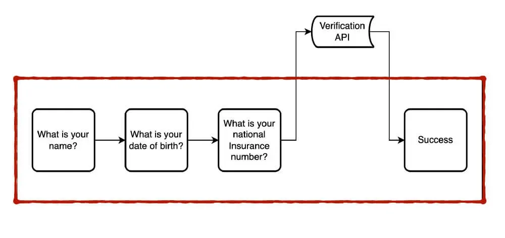
In this scenario, the microservices exist purely as back-end applications and they connect to front-end applications via endpoints.
The user interacts with a relatively simple front-end. It handles the session and the routing, but when it comes to complex business logic like verifying somebodies' identity, it hands over all the data and waits for the microservice to do its job, and routes the user accordingly based on the response.
The main reason I see people resisting this approach is control. They want to own the user interface so that everything is in a tidy little silo and us pesky designers can't mess with it!
To a point, this makes sense. If you do not have good design maturity in your organisation, your interfaces lack consistency and familiarity.
Are APIs in scope?
True APIs are not usually covered by the scope of the regulations, because they do not have a user interface. They simply pass data back and forth between two or more applications.
So, if you're the team responsible for building the microservice, if you choose to do an API there's probably very little accessibility work to do.
The exception to this might be if the API has an admin interface, where a user can log in and perhaps create, update or delete endpoints. In this case, then the user interface for the admin area would fall under the scope of the regulations and need to be made accessible.
As a general rule of thumb, if a user interacts directly with content rendered by the application, then it falls in-scope of the accessibility regulations. If the interactions are purely machine-to-machine and it's just passing back data and status updates, then it does not.
Data, not markup
An API should be used purely to pass back data and status updates.
If your API is passing back markup, such as blocks of HTML, and expecting the requesting application to simply render them out, then your API could become a single point of failure.
Although, if you're doing this, you probably have bigger issues to worry about than just accessibility! Most applications should automatically escape any markup that comes in like this for security purposes. You don't want any bad actors injecting a whole bunch of markup into your page!
The requesting application should have full control over the user interface. They should be able to decide which elements are right for the way they lay out the content out on the page.
If you're passing back markup which doesn't fit the design of the requesting application, then they're going to have to do a lot of clean-up work to make it usable for their own context.
Failing gracefully
Any application using an API should not be dependent on it for its own usability or accessibility compliance.
The requesting application must translate any responses and use those to present information back to the user in a clear and accessible way.
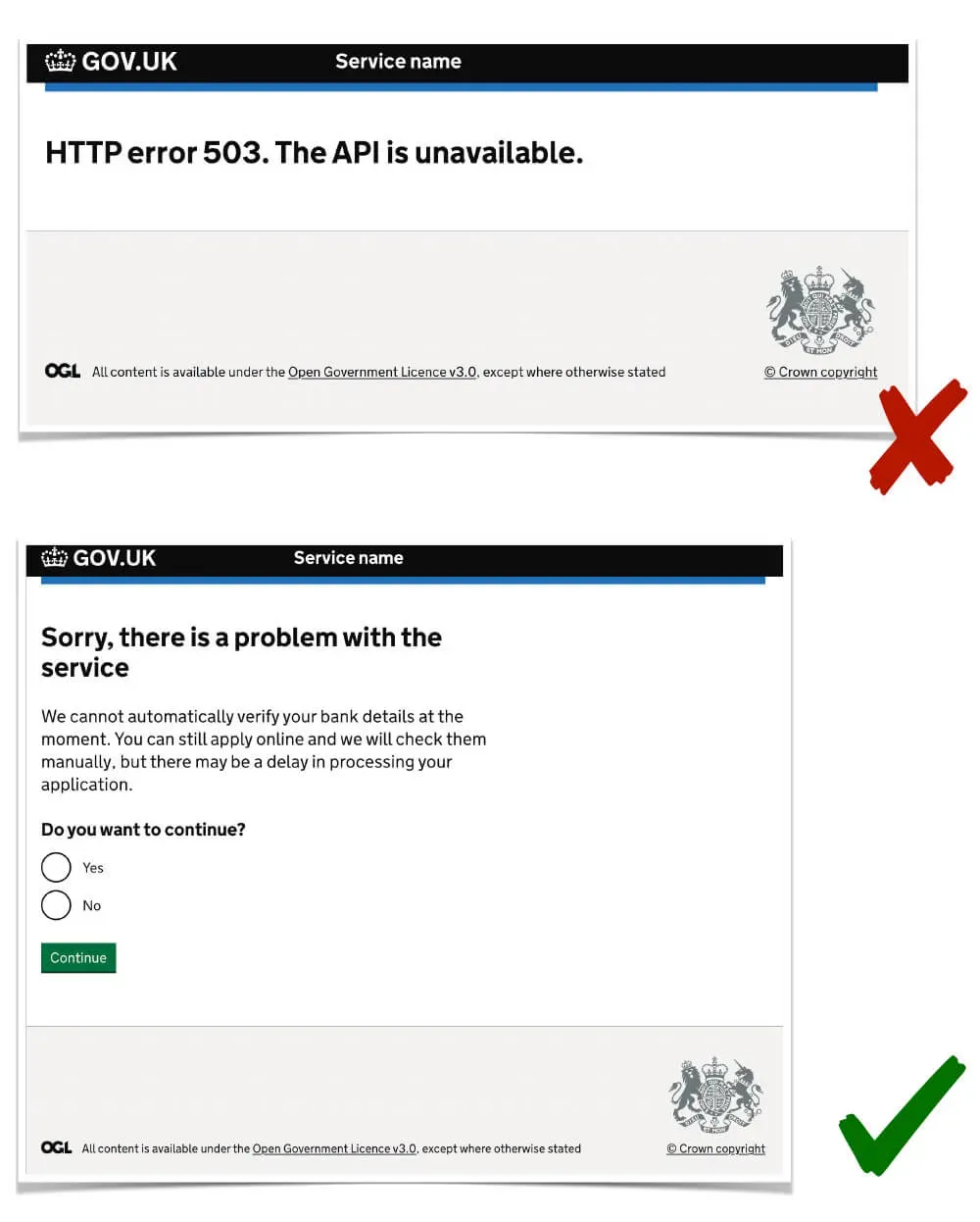
For example, if the API is unavailable and the client application gets a 503 error, it should not just present this error to the user. Very few people actually know what a 503 error is.
The application should instead do the hard work, decipher the problem, and explain it to the user in a way which makes sense.
Design patterns for the win
The easiest way to build an accessible microservice is to build a robust API and publish good documentation and design patterns for people wanting to use it.
This is where good design systems really shine. You can own the data, you can own the process and you can own the user interface to a point, but you don't become a bottle neck or a single point of failure.
Lets go back to our naming example. Your API might require the names in a certain data format.
Such as:
"person": {
  "name1": "string",
  "name2": "string"
}
With good documentation on what the API expects, and a recommended design pattern showing the two fields with 'first-name' and 'last-name', for most services they will all implement the pattern as standard.
So, you have your ownership of the design, you have your consistency for your user, and you have the data in the format you need.
The difference is that the design is now flexible without configuration.
The integrating service has full control over their own user interface, they can change the content based on their user research, and still provide the API with the data that it needs to work.
Conclusion
Almost anything can be made accessible. But, depending on how you build your microservice will determine how much work you have to do!
The redirect approach is not necessarily a write off. If you have a small number of services and strong design maturity in your organisation, then you might not run into a lot of the problems I've outlined in this post.
I'm not saying there is only one way to build a microservice. APIs and design patterns are just my recommended approach.
All I ask is you consider each of the issues I've outlined, and really think about how they impact your users.
Don't just commit blindly to a strategic solution that's going to lock your organisation into accessibility hell for the next 20 years. Because, as annoying as WCAG might be for you when you're building it, it's always users who truly suffer.
Weigh up all your options. Make accessibility a priority. Lead by example.
Thanks for making it to the end!
Craig
Post details
- Published:
- Read time:
- 9 minutes