Deque Axe Assistant - First impressions
A few days ago, Deque launched "axe Assistant", which they're calling "an AI chatbot built for all your accessibility questions".
The marketing email stated:
"It answers any digital accessibility question—from policy guidance to code-level implementation—with responses grounded in Deque University, the industry’s most authoritative knowledge source."
Now, anyone who knows me, knows I'm fascinated by large language models (LLM), especially those that have been trained for a very specific purpose.
I've spent most of my career in User-Centred Design, where I see people design for the masses and not for the edge cases. And because humans have a terrible track record of considering those people in the margins, any LLM trained on that data usually inherits those bad habits.
I've developed a weird fascination with challenging language models, thinking up edge-case questions or scenarios to really work out if it can do what is being claimed, or whether it's just reasonably convincing on the surface.
Most language models are useful, but usually, they aren't that great once you drift outside of the realms of common knowledge and into nuanced territory.
So, since the launch of axe Assistant, I've spent a few days testing it out! This post documents my findings!
Why I was curious to try axe Assistant
Deque have been angling their AI-driven approach for a while. They stated back in February that advancing AI for Axe is the next leap in digital accessibility.
Next, Deque opened AxeCon 2025 with a keynote titled "The State of Accessibility". In this talk, their CEO, Preety Kumar, shared a slide showing their vision, which was:
"100% of accessibility development, testing and fixing can be done with zero specialised accessibility knowledge with Deque solutions."

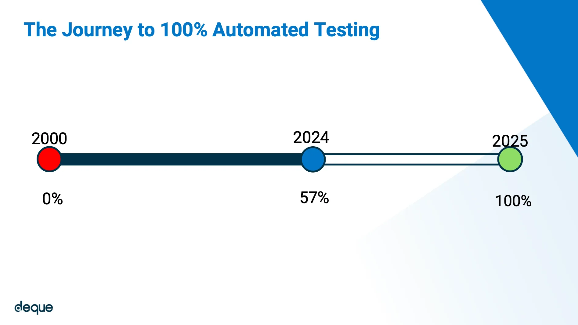
They also shared a timeline, suggesting they can currently automate testing for around 57% of known accessibility issues now, but will be able to achieve 100% automation in 2025!
This talk raised a few eyebrows, and there was quite a bit of backlash online, which I'm not going to get into here. But the fact that it's mid-2025, and Deque just unveiled their AI offering, made me think this was perhaps what they were sitting on when they suggested they'd be able to hit that 100% target.
Challenging an LLM
Testing something is hard, you have to find the right threads to pick at.
I knew if I just waded in and started asking axe Assistant about accessibility, it would look pretty good. ChatGPT, Claude and Gemini are all pretty convincing if you just open up a chat and start asking them stuff. But when you really get into it, asking tough questions or getting super specific, they all just start rambling.
So, for axe Assistant, I decided to try and understand:
- Can it fix uncommon accessibility issues in code?
- Can it accurately identify which WCAG 2.2 criteria to assign to failures?
- Is it able to understand context enough to restructure content properly?
- Can it find readability issues that aren't to do with reading level?
Quotes and citations
Responses from axe Assistant are copyrighted by Deque. All quotes shared by axe Assistant in this post have been cited properly in line with Deque's Axe Assistant Privacy, and Terms of Use, and Limitations on Liability, which on the date this post was published states, "You MAY share or quote responses verbatim, citing axe assistant and Deque University as the source."
Allowed Usage and Restrictions
- You MAY consume axe Assistant's responses for personal use.
- You MAY share or quote specific responses or conversations verbatim, citing axe Assistant and Deque University as the source.
- You MAY NOT claim these responses as your own.
- You MAY NOT republish these responses in derivative works.
- You MAY NOT use these responses to train other AI models, or to interact with other AI models in any way.
The tests
Test 1: Can it fix nuanced accessibility issues in code?
What I tested
For this test, I wrote a block of deliberately terrible HTML code, with the following issues:
- I placed a
<h1>outside of the<main>landmark, which can create issues for people with visual impairments navigating by landmarks, as they would miss important context. - I correctly set the page language to English by adding the
langattribute to the<html>element and giving it the valueen. However, I also added the samelangattribute again to the<p>element, which is completely unnecessary. This probably wouldn't cause any accessibility issues on its own, but it's definitely a code smell. - I added the attribute
dirand the valuertlto the<p>element, which sets the reading direction to right-to-left, instead of the left-to-right direction that is required for English. This can visually make the text difficult to read and in some cases will visually reposition punctuation at the start of lines.
The raw code was as follows:
<!DOCTYPE html>
<html lang="en">
  <head>
    <meta charset="utf-8">
    <title>Accessibility test</title>
  </head>
  <body>
    <h1>
      What is wrong with this code?
    </h1>
    <main>
      <p dir="rtl" lang="en">
        Can you tell?
      </p>
    </main>
  </body>
</html>
Results
I copied and pasted the code into axe Assistant, and I asked it, "What accessibility issues can you see in this code?"
The response by axe Assistant and Deque University was:
Based on the HTML snippet you provided, there are a couple of accessibility issues to consider:
Incorrect Use of
dirAttribute: The<p>element has thedir="rtl"(right-to-left) attribute while its language is set to English (lang="en"). This can create confusion for screen readers and users who expect English text to be presented in a left-to-right format. If the text is indeed in English, thedirattribute should be set toltr(left-to-right) instead.Language Markup: The
langattribute is correctly applied to the<p>tag, which is good. However, if the text is in English, it should not have thedir="rtl"attribute. It's essential to ensure that the language and directionality are consistent to provide an accurate reading experience for assistive technologies.Recommendations for Fixes
- Change the
dirattribute in the<p>tag toltrif the text is in English:<p dir="ltr" lang="en">Can you tell?</p>
Analysis
Axe Assistant correctly identified that the reading direction was the wrong way around for English. However, the fix it suggested was to keep the lang attribute and change the value to ltr instead.
This fix would likely work, but it's not the best solution. It would leave unnecessary attributes in the code, which could cause bugs. It also bloats the codebase, which will add bytes to file sizes. It may not seem like a big deal here, but if you implemented fixes like this over dozens of pages and thousands of lines of code, it would add up.
Axe Assistant failed to realise that having the <h1> outside of the <main> element could cause accessibility issues. It didn't mention this issue at all.
It also failed to realise that the lang attribute on the <p> tag was completely unnecessary. It said it was "correctly applied" and praised it for being "good".
I was hoping to see it suggest something like the following fixes:
- Move the
<h1>element inside the<main>element and position it at the top - Remove the
dirattribute and thertlvalue from the<p>element - Remove the
langattribute from the<p>element
Which would leave you with the following code:
<!DOCTYPE html>
<html lang="en">
  <head>
    <meta charset="utf-8">
    <title>Accessibility test</title>
  </head>
  <body>
    <main>
      <h1>
        What is wrong with this code?
      </h1>
      <p>
        Can you tell?
      </p>
    </main>
  </body>
</html>
Test 2: Can it accurately identify which WCAG 2.2 criteria to assign to failures?
What I tested
For this test, I again wrote some awful HTML code, which contained a button and a link. Neither had an accessible name, because they only contained visual content, and I did not provide a text description. The code was as follows:
<a href="/about-us">
    <img src="learn-about-us.png">
</a>

<button onclick="window.location.href='/learn-about-us'">
  <svg>
    <path d="M10 10 L20 20" />
    <path d="M10 20 L20 10" />
  </svg>
</button>
I chose these two things because they're essentially the same problem, but they fail different WCAG criteria.
A link with no accessible name, due to containing an <img> element with no alt attribute, would fail:
A button with no accessible name, due to containing an <svg> with no role attribute, would fail 4.1.2 Name, Role, Value.
Results
I copied and pasted the code into axe Assistant and asked it: "I have a button and a link, neither of which appears to have an accessible name. Can you identify the problem, and can you tell me exactly which WCAG 2.2 criteria this would fail?"
The response by axe Assistant and Deque University was:
Identifying the Problem
Link with Image: Issue: The link contains an image but does not have any alternative text (
altattribute) for the image. As a result, screen reader users will not have any context about what the link is for.Button with SVG:
- Issue: The button uses an SVG graphic without an accessible name. Screen readers cannot interpret the SVG alone, and without a text label, users will not know the purpose of the button.Relevant WCAG 2.2 Criteria
Here are the specific WCAG criteria that apply to these issues:
For the Link: - 1.1.1 Non-text Content: This criterion requires that all non-text content (like images) have a text alternative that serves the equivalent purpose. Since the image does not have an
altattribute, it fails to meet this requirement.For the Button: - 4.1.2 Name, Role, Value: This criterion states that user interface components (like buttons) must have a programmatically determined name. The button lacks a text label or an accessible name, which makes it non-compliant.
Suggested Fixes
- Link:
- Add an
altattribute to the image that describes its purpose. For example:<img src="learn-about-us.png" alt="Learn about us">
- Button:
- Provide an accessible name for the button. You can do this by addingaria-labelor wrapping the SVG in a text label. For example:<button aria-label="Learn about us"…
Analysis
Axe Assistant correctly identified that the image was missing an alt attribute. It also correctly assigned this failure to 1.1.1 Non-text Content. The suggested fix was also pretty good and would have been sufficient to pass this criterion.
It also correctly identified that the button was missing a label. It correctly assigned this failure to 4.1.2 Name, Role, Value, and again, the suggested fix would have been sufficient to pass this criterion.
However, it did not mention that due to the link having no accessible name, it would also fail 2.4.4 Link Purpose (In Context) and 2.4.9 Link Purpose (Link Only).
The fixes it provided for the link would have been sufficient to also pass these criteria, so we could probably argue it's a bit of a moot point. Also, Deque seem to work on a principle of "reducing noise". So, it might not have mentioned the other 2 criteria by design.
But, if we're being pedantic, the question I asked was, "Can you tell me exactly which WCAG 2.2 criteria this would fail?" And, it couldn't.
Test 3: Is it able to understand context enough to restructure content properly?
What I tested
For this test, I took a section of text from the GOV.UK Design System Accessibility Strategy and tampered with the heading levels.
I chose this text because it went down as far as <h4>, and it was pretty clear which heading level each block of text should be nested under.
I did have to remove a lot of the paragraph text and tweak it, as axe Assistant only allows a maximum of 2000 characters. But the sentiment of the text remains unchanged.
The raw code was as follows:
<!DOCTYPE html>
<html lang="en">
  <head>
    <meta charset="UTF-8">
    <title>Accessibility Strategy</title>
  </head>

  <body>
    <main>
      <h3>Accessibility strategy</h3>

      <h5>Prioritising accessibility concerns</h5>
      <p>
        We use ‘accessibility concern’ to mean any question about
        the accessibility of part of a product.
      </p>

      <h3>Concern types</h3>
      <p>Concerns fall into two categories:</p>

      <h2>Theoretical</h2>
      <p>
        Issues or questions lacking new evidence or relevant
        research.
      </p>

      <h1>Evidenced</h1>
      <p>
        Concerns supported by evidence, such as user reports or
        audit results.
      </p>

      <h5>Determining severity</h5>
      <p>
        High-severity concerns usually meet at least one of these
        criteria:
      </p>
      <ul>
        <li>They hinder or block users from completing tasks</li>
        <li>
          They affect essential services or critical
          infrastructure
        </li>
        <li>
          They can’t be efficiently resolved by individual
          teams
        </li>
      </ul>

      <h4>Disagreement</h4>
      <p>
        Not all concerns are agreed on. We resolve these using 3
        escalation levels:
      </p>

      <h6>Level 1</h6>
      <p>
        If the GOV.UK Design System team confirms the concern,
        work continues
      </p>

      <h3>Level 2</h3>
      <p>If the team can’t confirm it, they:</p>
      <ol>
        <li>Assess its severity</li>
        <li>
          If not high-severity, keep discussing it within
          relevant teams and communities
        </li>
      </ol>

      <h1>Level 3</h1>
      <p>
        If still unresolved and considered high-severity, the GDS
        accessibility team is asked for a second opinion.
      </p>
    </main>
  </body>
</html>
Results
I copied and pasted the raw code into axe Assistant, and I asked it, "What accessibility issues are in this code?"
The response by axe Assistant and Deque University was:
Accessibility Issues
- Heading Structure:
- The heading levels are not used hierarchically. For example, you have an
<h3>followed by an<h5>, then an<h1>, and so on. This can confuse screen reader users who rely on heading levels to navigate content.- Fix: Use a logical heading structure. For example, if you start with
<h3>, the next heading should be<h4>, and then you can use<h5>after that. Ensure that headings progress logically from<h1>to<h6>.
- Use of
<h1>:
- There are multiple
<h1>elements. Only one<h1>should be used per page to represent the main title.- Fix: Change all but one
<h1>to appropriate heading levels (e.g.,<h2>,<h3>, etc.) to maintain a single main heading for the document.
- Lack of Landmarks:
The code lacks landmark roles (like
<nav>,<header>,<footer>, etc.) that help users with assistive technologies navigate through the page.Fix: Consider wrapping sections in appropriate landmark elements to enhance navigation.
- Semantic HTML:
The use of headings for structure is good, but ensure that the content is structured semantically. For example, using
<p>for paragraphs and<ul>or<ol>for lists is correct, but ensure the content inside is meaningful and relevant.Fix: Review the content and ensure that the elements used are semantically appropriate for their content.
Suggested Code Adjustments
Here’s a revised version of your code with these improvements:
<h1>Accessibility strategy</h1>

<h2>Prioritising Accessibility Concerns</h2>

<h2>Concern Types</h2>

<h3>Theoretical</h3>

<h3>Evidenced</h3>

<h2>Determining Severity</h2>

<h2>Disagreement</h2>

<h3>Level 1</h3>

<h3>Level 2</h3>

<h3>Level 3</h3>
Note, in the example I extracted the headings rather than repeating the entire contents again, as they were the only things changed.
Analysis
Axe Assistant did correctly identify that the heading levels were incorrect. It also noted that the page should only have a single <h1>, which is not strictly necessary to pass WCAG, but it is usually considered best practice, therefore, this information is definitely useful!
However, it failed to structure the headings properly in the suggested fix. In the original GOV.UK Strategy Document, "concern types" are nested under "prioritising accessibility concerns".
It almost got it right, but getting it wrong on the third heading caused a knock-on effect, so all the headings below it were technically out of order too.
The correct order should have been:
<h1>Accessibility strategy</h1>

<h2>Prioritising Accessibility Concerns</h2>

<h3>Concern Types</h3>

<h4>Theoretical</h4>

<h4>Evidenced</h4>

<h3>Determining Severity</h3>

<h3>Disagreement</h3>

<h4>Level 1</h4>

<h4>Level 2</h4>

<h4>Level 3</h4>
It also claimed that the document lacked landmarks like <nav>, <header> and <footer>, and suggested I wrap the content in appropriate landmarks. But, as this is just a single-page document, and the content is wrapped in an appropriate <main> landmark, this advice is not helpful.
It also gave some generic advice on semantics, saying I should check that my content is structured correctly. Which, as it is structured correctly, is again just noise.
We could probably argue that if it had access to more context, it might have done a better job, but the 2000 character limit is placed on axe Assistant by Deque themselves.
Test 4: Can it find readability issues that aren't to do with reading level??
What I tested
For this test, I wrote the following block of text about the European Accessibility Act. I deliberately wrote it all in capital letters, which can cause readability issues, particularly for people with Dyslexia.
THE EUROPEAN ACCESSIBILITY ACT (EAA) IS A PIECE OF LEGISLATION DESIGNED TO IMPROVE THE ACCESSIBILITY OF PRODUCTS AND SERVICES ACROSS THE EUROPEAN UNION. IT AIMS TO REMOVE BARRIERS FOR PEOPLE WITH DISABILITIES BY REQUIRING COMPANIES MAKE DIGITAL PRODUCTS LIKE WEBSITES, MOBILE APPS, E-BOOKS, ATMS, AND ONLINE SHOPS ACCESSIBLE TO ALL USERS.
Results
I copied and pasted the paragraph into axe Assistant, and I asked it, "Are there accessibility issues with this text?"
The response by axe Assistant and Deque University was:
The text you provided about the European Accessibility Act (EAA) is generally well-structured for readability, but there are a few considerations to enhance its accessibility:
Accessibility Issues
Text Structure: The text is presented as a single block without any headings or subheadings. This can make it difficult for users, especially those using screen readers, to navigate the content effectively.
Length and Complexity: The sentences are quite long and complex. Breaking them down into shorter sentences can improve comprehension, especially for individuals with cognitive disabilities.
Lack of Lists: The points related to digital products (e.g., websites, mobile apps, e-books, ATMs and online shops) could be formatted as a bulleted or numbered list. This would help users quickly identify key information.
Suggestions for Improvement
Use Headings: Introduce headings to categorize sections of the text. For example, a heading like "Overview of the European Accessibility Act" could precede the main content. Shorten Sentences: Break down long sentences into shorter, clearer statements. For instance, instead of "It aims to remove barriers for people with disabilities by requiring companies to make digital products...," you could say, "The EAA aims to remove barriers for people with disabilities. It requires companies to make digital products accessible." Incorporate Lists: Use bullet points to outline key objectives or benefits of the EAA. This improves clarity and allows users to scan the information easily.
Here’s a revised version of your text that incorporates these suggestions:
Overview of the European Accessibility Act (EAA)
The European Accessibility Act (EAA) is a key piece of legislation designed to improve accessibility across the European Union. Its main goals include:
- Removing Barriers: The EAA aims to eliminate obstacles for people with disabilities.
- Accessibility Requirements: Companies are required to make digital products, such as:
- Websites
- Mobile apps
- E-books
- ATMs
- Online shops
Analysis
Axe Assistant failed to mention anything about the fact that it was written entirely in uppercase letters.
In hindsight, this could be that LLM are probably trained to sanitise their inputs. So, it may have potentially only looked for accessibility issues in the text after it had already altered the casing. However, it still highlights a potential issue if you rely on these types of technologies to identify issues with your content.
The content design suggestions it provided are actually pretty good! Using headings, short sentences, and lists is definitely better for readability. But, I wouldn't suggest that is necessarily the best guidance for a paragraph made up of just 2 sentences.
In its attempt to "revise my text", it has converted everything to sentence-case, which is what I was hoping it would do, but in rewriting it, I'd argue it's made the content more difficult to navigate by creating a nested list.
Also, in restructuring the content, it now sounds factually incorrect to me. For example, in the original version I had the following sentence:
"It aims to remove barriers for people with disabilities by requiring companies make digital products like websites, mobile apps, e-books, ATMs, and online shops, accessible to all users"
In the restructured version, I feel like it is implying that all companies are required to make certain types of digital products, as it now reads:
"Accessibility Requirements: Companies are required to make digital products, such as: Websites, Mobile apps, E-books, ATMs, Online shops"
Conclusion
If I'm brutally honest, the conclusion I came to is that I'm absolutely not surprised by how axe Assistant performed.
It performed exactly as I'd expect a Large Language Model to perform when asking it about accessibility, producing a lot of generalised information that is potentially useful, but falling short when asked to be specific or confronted with nuanced problems.
That's not to say it's bad. It provides helpful general advice, but doesn’t stand out when nuance is needed. So, like with all AI tools, treat its responses with rigour and due diligence.
Final thoughts
I don't know what technology axe Assistant is running under the hood. I tried asking it, but it looks like it has some kind of prompt shielding in place to stop that kind of information from getting out. But, it did tell me its training cutoff date is October 2023, which would make sense as WCAG 2.2 was released the same month.
With a training cutoff of October 23, that date suggests it likely isn't built on top of the latest models like GPT-4o or Claude 3.7 Sonnet. So, taking an educated guess, it's perhaps built on top of something like Mixtral or Llama, then heavily customised, but this is purely me speculating.
Like all LLM, Axe Assistant is only as good as the information it's trained on. It is trained using all the data in Deque University, which is an amazing resource full of brilliant information. But at this point, it's not looking like that's enough to make it stand out as the obvious choice when compared to other cloud-based LLM.
When the foundation of an LLM is trained on billions of code examples to use as reference points, and its job is to respond based on probability, those bad examples will inevitably float to the top. This makes it unlikely that adding additional context and materials into Language Models, in their current form, will ever be suitable for solving gnarly accessibility problems.
This paradigm is interesting to ponder. Is this Language Model problem unique to accessibility? It's such a challenging part of software development that there are very few good examples. Are there any other areas like this? Where, there probably just isn't enough good data to override the masses of flawed examples which make up the bases of its foundational knowledge.
Further reading
If you found this post interesting, I have written some other posts on AI which you might also find interesting:
- Can generative AI write contextual text descriptions? (TetraLogical blog)
- AI doesn't need to think. We do!
- ChatGPT: Ethics and bias
- ChatGPT: Everybody's dirty secret
Thanks, Craig
Post details
- Published:
- Read time:
- 14 minutes
- Tags: